Where can we find tiny opportunities to improve instruction?
There's a lot of stuff out there trying to teach us something. And a lot of it could be doing better.
Sometimes, I think about stuff that’s not related to instructional design or learning. Although if you’ve ever read my posts about learning cello or weightlifting, you might disagree. Fair point, as these topics do kind of creep into my mind a lot.
It’s just that a lot of content that doesn’t seem to be about learning does have some kind of learning component lurking in there. There might be something, even a small something, that you could tweak to make people better understand the point you’re trying to make.
How my (non)relationship with running made me think about instructional design
Take me and running. More recently, I’ve been thinking about trying running, something I have always hated. You know, one of those people who make hating running part of their identity. Weightlifting? My body is BUILT for that. I’m short. Shorter levers give me an advantage in weightlifting, according to physics. However, my stubby legs do not help me when it comes to running.
Begrudgingly, though, I will admit that some steady state cardio in my life would probably help my goals of getting stronger. It turns out that you do need your cardiovascular system to lift heavy things and put them back down.
As a proper elder Millennial, I turned to YouTube to begin to explore the idea of becoming a runner (or, let’s be honest, a run/walker). It was here that I ran into a recent YouTube trend. Every time I see videos using this trend’s format, it’s been driving the instructional design portion of my brain (which is kind of a lot of it) absolutely batty.
The YouTube “ranking” video trend
YouTubers have been creating videos where they take a list of popular ideas, usually centered around a specific topic. They discuss the merit of each idea and rank it by giving it letter grades on a scale of A-F. Many of these ranking videos go beyond A-F and have an “S” tier, which stands for superior, and is thus above A-tier.
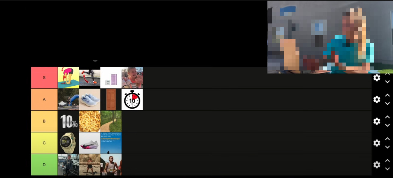
I recently watched a video ranking training and recovery myths related to running, since I’m not trying to injure myself trying this running thing. The video I watched made the same mistake that many YouTubers are repeating, structuring their tier list like so:

In the US, at least, red is typically associated with bad (stop!) and green is usually associated with good (go!). Yellow, meh, pause. Think stoplights when driving.
Look carefully at this image, though: the red tier is labeled S-tier. Superior. D-tier, which is the lowest rank a myth can receive in this video, is green.
I’ll admit, this is a really small detail. But in watching, I found myself putting forth a little extra effort to remember that red was superior in this case and green was bad.
Forcing my brain to put effort into something that is external to the content I’m trying to learn is inefficient–something known as extraneous load. Introducing extraneous load to instructional content means learners have less brain power to dedicate to actually learning that content. This article on extraneous load asserts, “The most important factors to keep in mind when trying to reduce extraneous load are avoiding split attention and redundancy.” In the case of this video, my attention was being split between trying to remember which tiers were good and bad, while also trying to remember the myths themselves.
The most important factors to keep in mind when trying to reduce extraneous load are avoiding split attention and redundancy.
What can we take away from this?
This is purely based on vibes, but I think sometimes those of us in the learning design field spend an awful lot of time thinking about the big stuff. Objective-aligned projects. Authentic assessments. Fully completed courses.
But designing effective learning exists in every tiny decision we make when we’re developing instructional content.
Next time you’re working on designing learning, pause to look at the little things: perhaps it’s your naming conventions. Your icons. The color of the drop-down menu you use for activities, versus the color of the drop-down menu you use for tool tips. Are you accidentally introducing extraneous load?
I really love ending articles with questions, so that’s it today, folks. Let me know in the comments what kinds of instructional design snafus you’ve come across in the wild!


Hi, Christie! Very good article. Your practice of ending with a question reminds me of a Yiddish proverb: “For every answer, you can always find another question.” On a different note, I do think cognitive overload is a real thing. At the same time, it can be subjective according to age, learning profile and the like. IMHO.